As I promised, I thought I would show an example using DPLYR. I decided to create my own data set, instead of going with a canned data set in R. I did this to preface my next few posts. After this post, I will be switching to webscraping in R and analysis of beer reviews. I know, I'm excited too.
The data I decided to use is a data set that I recently got by webscraping a very popular beer review site that publishes a highly respected top-250 beer list. It's not a terribly large data set, but it will illustrate the usefulness of DPLYR and answer a question I've always had about beer. That question we will answer is: "Does the abv of a beer influence the rating of a beer?"
I will make the beer webscraper available soon on my github, but I want to optimize the code first. But since I got it working, I downloaded a top 250-beer list and all the reviews/dates/ratings for those beers. Let's take a look at the data.
> str(data)

'data.frame':	72971 obs. of  9 variables:

 $ name   : chr  "90 Minute IPA" "90 Minute IPA" "90 Minute IPA" "90 Minute IPA" ...

 $ date   : Date, format: "2007-04-09" "2007-04-07" "2007-04-02" "2005-07-03" ...

 $ rating : num  4.33 4.8 4.85 4.47 4.53 4.2 4.51 4.48 4.34 4 ...

 $ state  : Factor w/ 165 levels "","0","Alabama",..: 22 12 49 48 47 65 32 43 38 13 ...

 $ review : chr  "redoing this as my review was unceremoniously deleted (BA tip: never, ever complain at all if your avatar, and free speech righ"| __truncated__ "Received in a trade from geexploitation. An excellent beer in my opinion. When pouring, I thought it looked a little lite and p"| __truncated__ "This was really an exceptional beer from start to finish. I can't say enough about it. Absolutely remarkable drinkability and b"| __truncated__ "This IPA pours a beautiful golden color, it leaves a nice sticky white lace that sticks to the side of the glass. The smell is "| __truncated__ ...

 $ style  : Factor w/ 37 levels "American Amber / Red Ale",..: 4 4 4 4 30 7 7 7 7 7 ...

 $ abv    : num  9 9 9 9 12 7.25 7.25 7.25 7.25 7.25 ...

 $ brewery: chr  "Dogfish Head Brewery" "Dogfish Head Brewery" "Dogfish Head Brewery" "Dogfish Head Brewery" ...

 $ link   : chr  "http://beeradvocate.com/beer/profile/10099/2093/" "http://beeradvocate.com/beer/profile/10099/2093/" "http://beeradvocate.com/beer/profile/10099/2093/" "http://beeradvocate.com/beer/profile/10099/2093/" ...
So we are dealing with about 70,000 observations of ratings/reviews for the top 250 beers. And yes, the first reviews there are for the famous Dogfish Head 90 Minute IPA. Yum. I'm getting thirsty already.
Back to 'dplyr'. dplyr introduces something that should be standard in R: converting data frames to a non-printable data frame. One of my pet peeves is accidentally asking R to print out a LARGE data frame, and eating up memory, CPU, and time. Check out the fix.
> data_dplyr = tbl_df(data)

> data_dplyr

Source: local data frame [72,971 x 9]

                 name       date rating            state

1       90 Minute IPA 2007-04-09   4.33         Illinois

2       90 Minute IPA 2007-04-07   4.80       California

3       90 Minute IPA 2007-04-02   4.85     Pennsylvania

4       90 Minute IPA 2005-07-03   4.47           Oregon

5  Adam From The Wood 2005-09-12   4.53 Ontario (Canada)

6        AleSmith IPA 2013-09-30   4.20        Wisconsin

7        AleSmith IPA 2013-09-30   4.51    Massachusetts

8        AleSmith IPA 2013-09-29   4.48         New York

9        AleSmith IPA 2013-09-15   4.34      Netherlands

10       AleSmith IPA 2013-09-15   4.00         Colorado

..                ...        ...    ...              ...

Variables not shown: review (fctr), style (fctr), abv (dbl), brewery (fctr), link (chr)
Nice. No more little nagging care about accidentally printing out data frames. AND you can do all the same operations on the new 'tbl_df' object as the regular data frame object.
I'm going to compare base R with dplyr in ordering data, selecting subsets, and mutating data by comparing system times for each. Let's look at ordering.
> system.time(arrange(data_dplyr,name,date,rating))

   user  system elapsed

   0.10    0.00    0.11

> system.time(data[order(data$name,data$date,data$rating),])

   user  system elapsed

   0.33    0.00    0.32
This is actually quite the speed up. dplyr's arrange function is about THREE TIMES FASTER than the base function order. AND this isn't that large of a data set. Zoinks, Batman! Let's do this with selecting subsets:
> system.time(select(data_dplyr,name,brewery,state))

   user  system elapsed

      0       0       0

> system.time(data[c("name","brewery","state"),])

   user  system elapsed

   0.08    0.00    0.08
Ok, so my system is obviously rounding down on the first time, so we can safely assume that the first time is less than 0.005 seconds. You might not notice much of a time difference here, but increase the size 1000-fold, and the difference between 80 seconds and 5 seconds is huge.
Let's say that I'm interested in the average rating of a beer PER abv. That means that I have to tell R that I want to take the rating value and divide it by the abv value for each row. (I realize there's a quicker pre-processing method, but for now, let's stick to this example for illustrative purposes). Comparing the times:
> system.time(mutate(data_dplyr,rating_per_abv = rating/abv))

   user  system elapsed

      0       0       0

> system.time(data$rating/data$abv)

   user  system elapsed

    0.01      0    0.01
Ok, so R-base is very close here, I can guess that we are about halving the time.
Let's use some more dplyr functions to see how the ratings of each beer relates to the ABV. The first thing we are going to do is use the group_by function to group our data frame by beer name. Then we will create a summarized data frame of interest that contains the number of reviews, average rating, and the abv.
> abv_rating_data = group_by(data_dplyr, name)

> rating_info = summarise(abv_rating_data,

                        count = n(),

                        rating_sum = mean(rating,na.rm=TRUE),

                        abv_sum = mean(abv,na.rm=TRUE))
Now let's load ggplot2 and make a nice plot with a smooth lowess line to illustrate a relationship.
> library(ggplot2)

> rating_info = filter(rating_info,abv_sum<20)
> ggplot(rating_info, aes(abv_sum,rating_sum)) + geom_point(aes(size=count), aplha = 0.7) + geom_smooth() + scale_size_area()
This will create the nice looking graph:
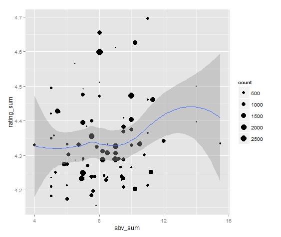
Yay! That was easy enough. What does this graph say? Maybe we can infer that from 4% abv to 12% abv, there's evidence for a very slight overall upward trend, but mostly no observable trend. (Notice that the sample size for beers > 12% is VERY small).
Cheers!